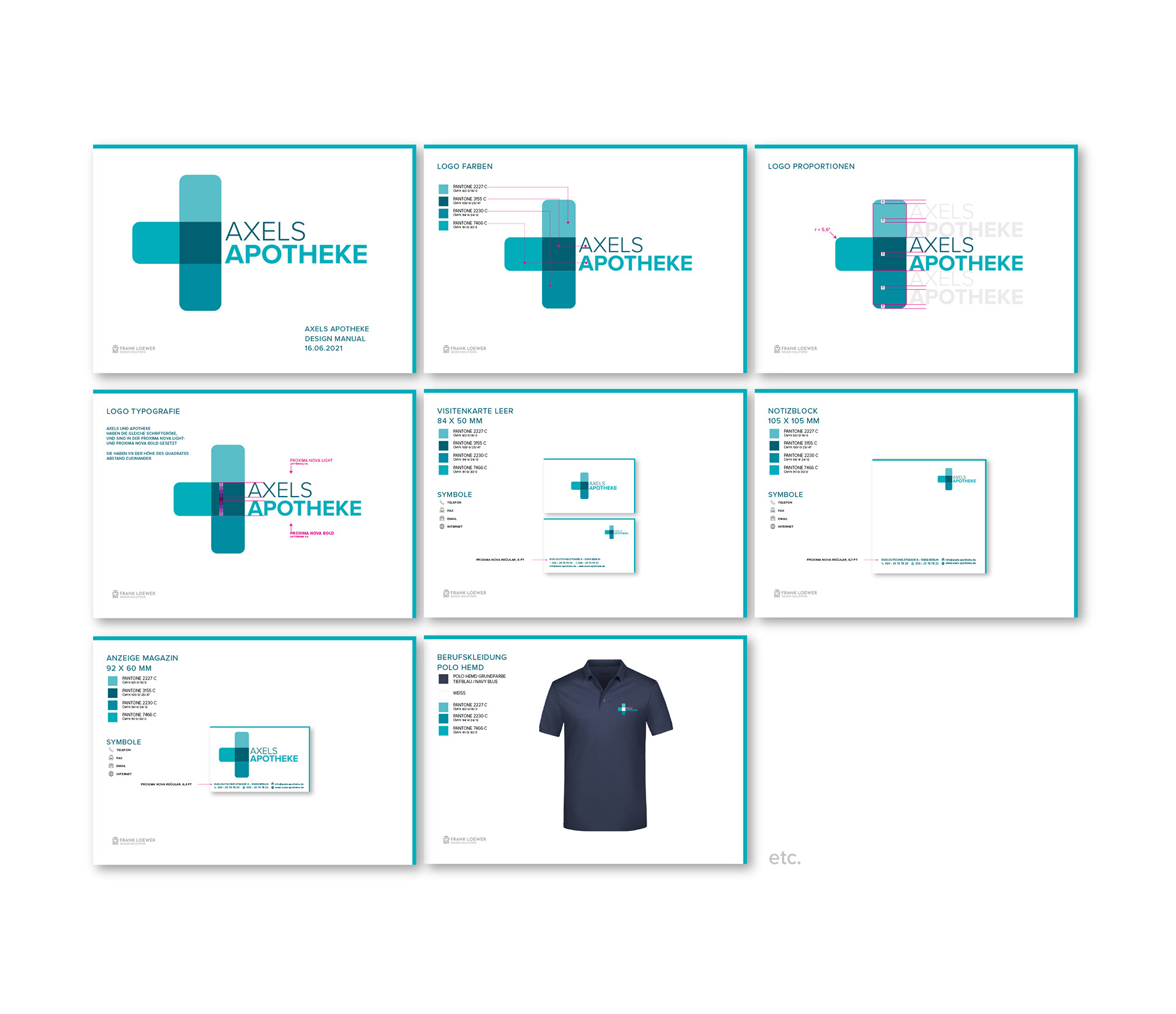
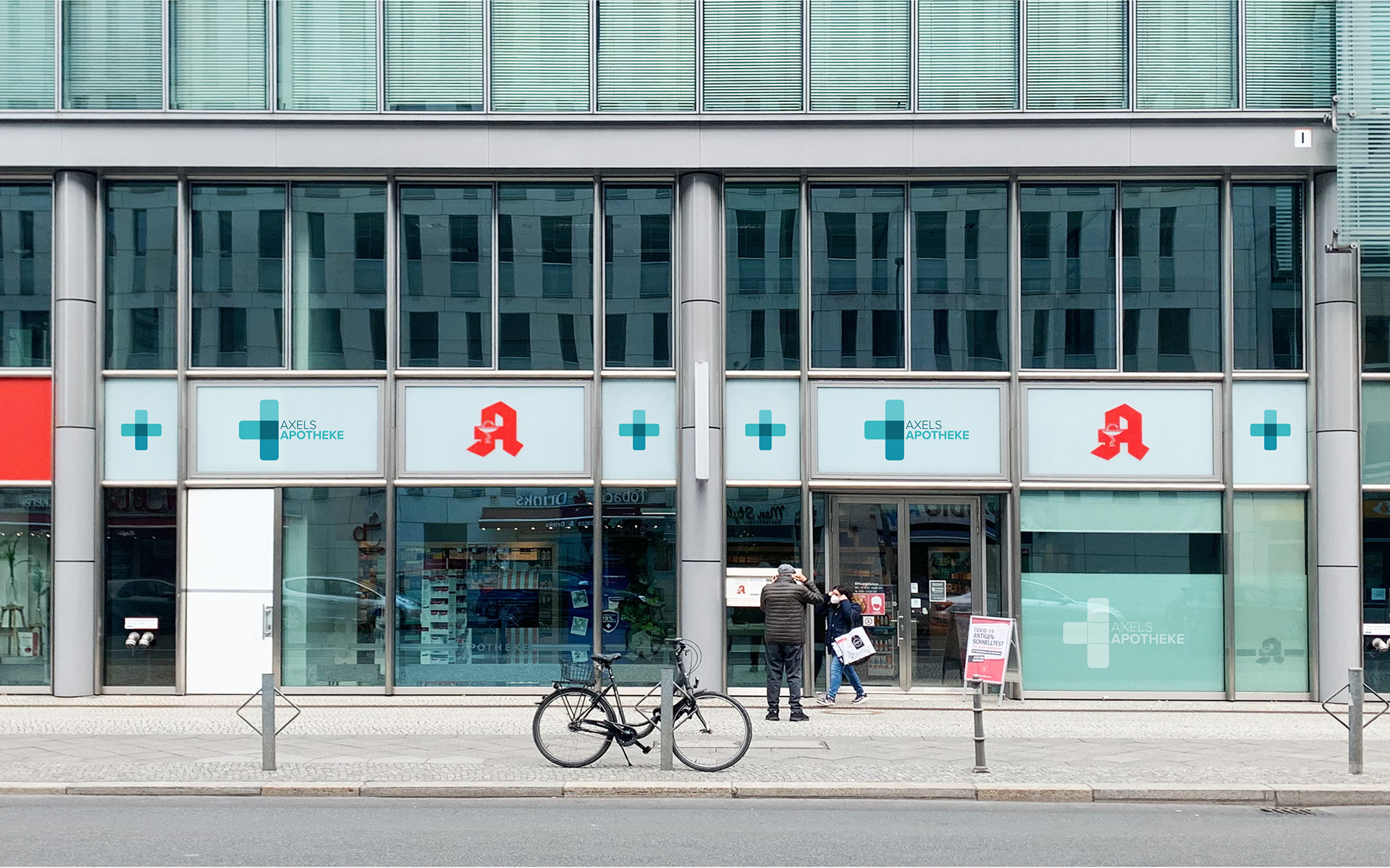
AXELS Apotheke is a modern independent pharmacy in Berlin. The project included the development of a complete corporate identity, from the logo and visual language to the overall brand appearance.
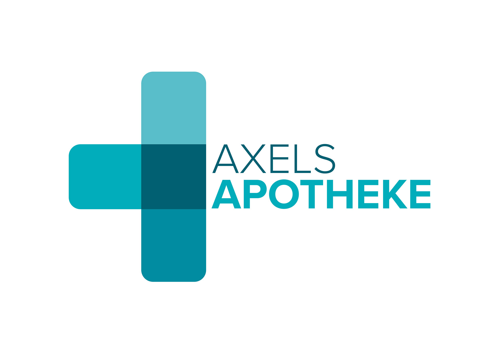
The logo is based on the universally recognized pharmacy cross, reinterpreted through overlapping geometric forms. The transparent intersections symbolize expertise, trust and the connection between healthcare, consultation and modern pharmaceutical services. A fresh turquoise colour palette reinforces the brand's approachable and contemporary character while ensuring strong recognition across signage, stationery and digital media.
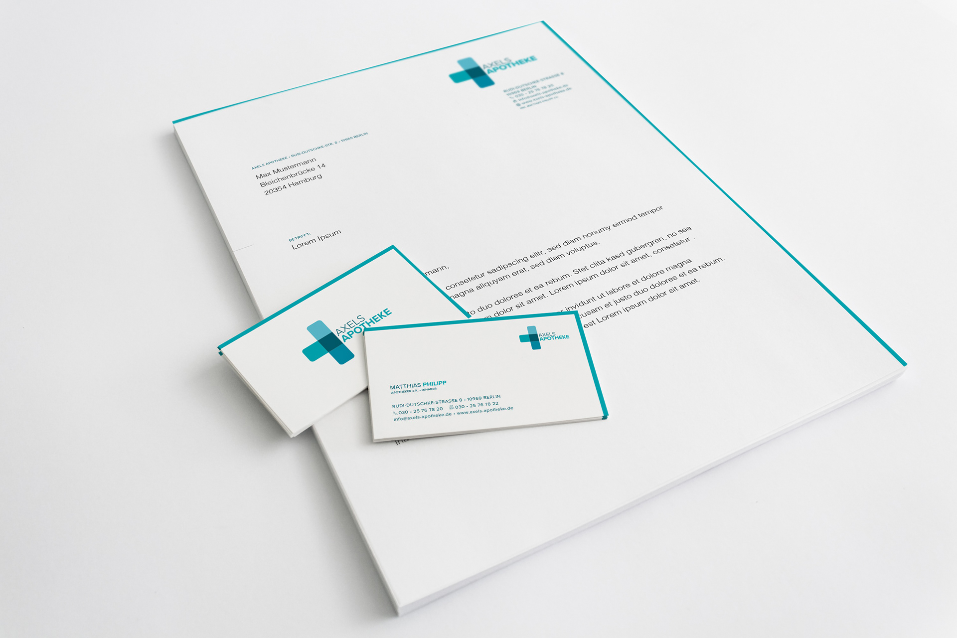
Stationary
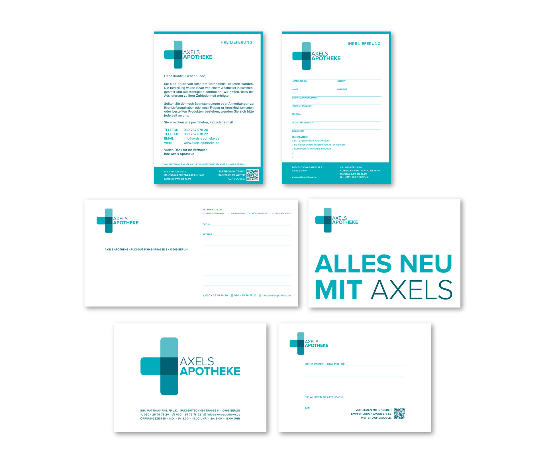
Stationary