

Eucerin’s First Proprietary Bottle Shape
From brand identity to bottle design: How Eucerin’s first proprietary bottle shape combines precision, ergonomics and industrial efficiency.
Designed by Frank Loewer – Freelance Communications & Packaging Designer

Eucerin’s First Proprietary Bottle Shape
From brand identity to bottle design: How Eucerin’s first proprietary bottle shape combines precision, ergonomics and industrial efficiency.
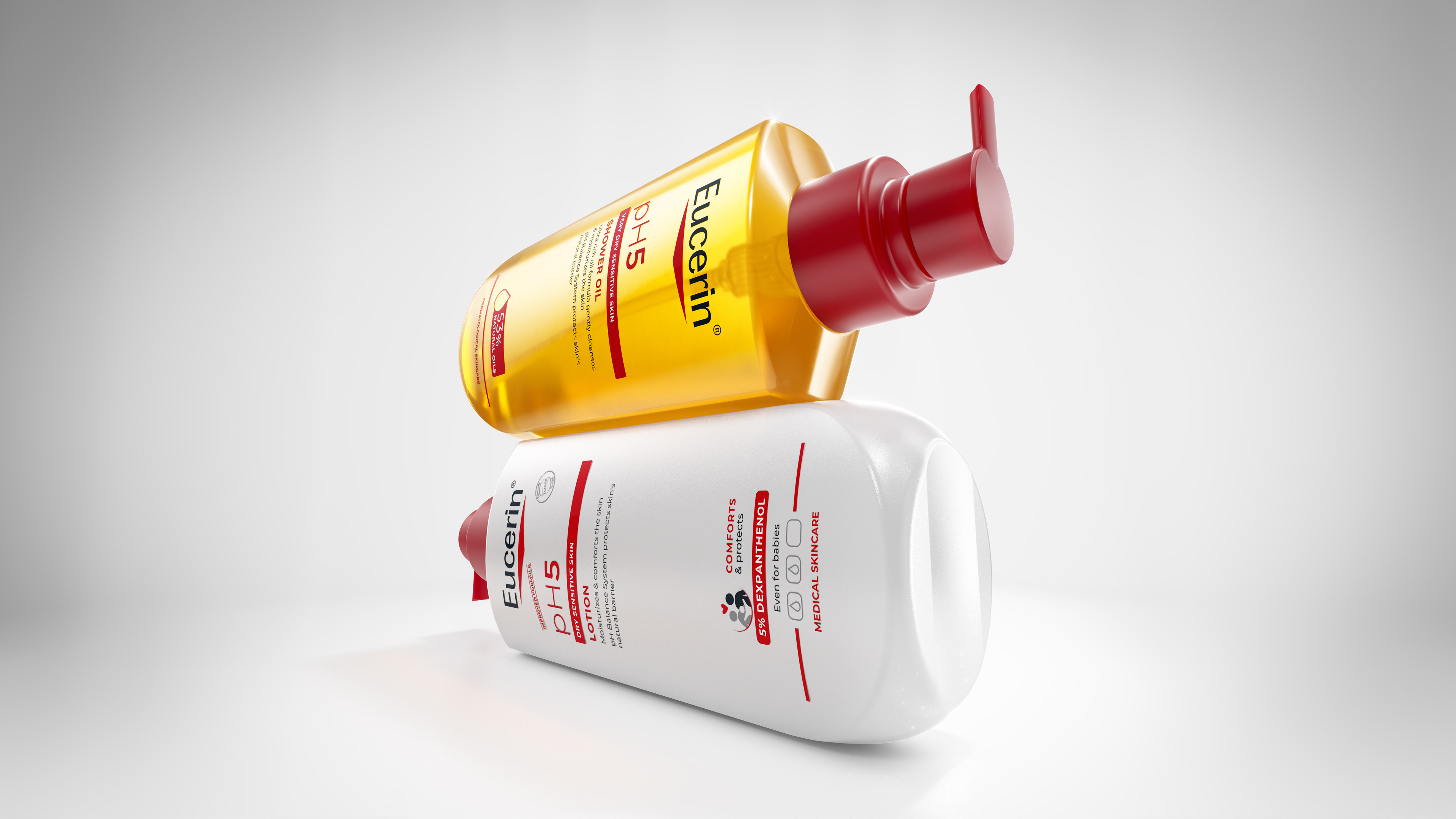
After more than two decades in which the portfolio was based on standardized, externally sourced packaging solutions, the current generation marks a fundamental shift: for the first time, Eucerin has its own completely distinctive silhouette. This relaunch is far more than a visual update; it is the consistent translation of dermatological expertise into a functional and tactile architectural language.
From Idea to Industrial Form
The development of the new geometry followed a methodical process that was consistently managed as an individual, dedicated design development. The foundation was formed by classic technical drawings. These detailed construction sketches precisely defined proportions, exact radii and complex surface transitions, ensuring a formal rigor that reflects the core of the brand. Based on these plans, the design was translated into highly precise 3D renderings and digital models. At this stage, the geometry was iteratively modified and refined until the design vision was fully aligned with all technical constraints and requirements. The resulting physical form models ultimately served as the exclusive basis for decision-making at Beiersdorf. Only through evaluation of the actual 1:1 object was it possible to assess the interaction of light and shadow across the surfaces as well as the real tactile experience.
Form Follows Empathy: The Duality of the Design
The design concept uses a deliberately staged duality to position the Eucerin brand on both an emotional and scientific level:
• Clinical Precision: The upper symmetry, with its controlled lines and architecturally defined shoulder area, conveys stability. It represents the “Precision Laboratory” – the scientific ambition at the heart of the brand.
• Human Connection: In contrast, the lower section follows the guiding principle “Softness of a Drop.” Its soft, organic modelling breaks through the technical rigor and creates a tactile experience. The bottle naturally fits into the palm of the hand, supporting intuitive daily application.
Efficiency Through Precision: Material Reduction and Technology
A key achievement of the new development lies in the technical optimization of the structure. Through precise surface design, it was possible not only to achieve a high level of overall stability, but also to significantly reduce the amount of plastic required. This substantial material saving demonstrates that sophisticated design and responsible resource use can be intrinsically connected. At the same time, the geometry was optimized for consistent “sleeveability”, ensuring reliable integration into industrial downstream processing.
A Shape with Purpose
The new bottle shape successfully establishes a distinctive and proprietary packaging solution that strengthens Eucerin’s brand profile while meeting the highest requirements for industrial feasibility and sustainability. The packaging therefore functions as more than a container: it becomes an ambassador for a brand that connects medical efficacy with human well-being.
Frank Loewer Freelance Communications and Packaging Designer
Published in / Editorial Feature
Creativ Verpacken 4 | 2026
„Die Architektur der Pflege: Eucerins erste eigene Formsprache“
www.creativverpacken.de

